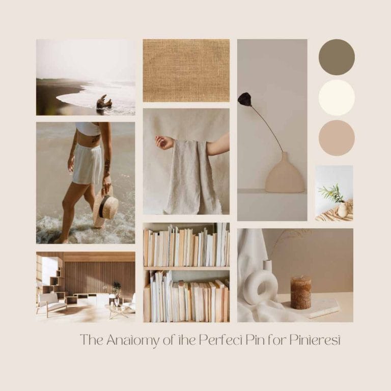
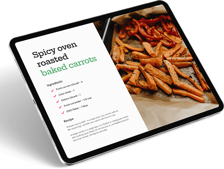
Here’s a fun exercise: Set up a secret board on Pinterest, then scroll around and only pin the pins you like.
Don’t worry about what they are about, what their description is like or if they have a link. Just go with the visuals. If ten of us did this, we would all end up with different content on our boards.
That’s because the perfect pin is very dependent on what we like and we all like different things.
However, that doesn’t mean it is impossible to create some basic design guidelines for the anatomy of the perfect pin for Pinterest. Yes, what you like is going to influence what you create, but that’s okay. If you were to look at those ten boards we talked about above, there’s a good chance we would have some overlap.
The key is to find out what makes those overlapping pins and then using it.
What Pinterest Says:
Pinterest offers some tips on how to make the perfect pin so it is always good to take a look at their advice. According to them, there are three things to concentrate on to make a perfect pin:
- Make them beautiful.
While beauty is in the eye of the beholder and all that, there are some things that help achieve it for everyone. High-quality images top the list, whether these are ones you have taken and edited yourself or that you have used from stock photo or PLR websites.
Tip: Remember you are working in a vertical format so look for images that work well this way.
If you are using more than one image, say for a “how to” pin or a “before and after” style pin, then limit how many images you use. Don’t go above four images and keep the text overlay short and to the point so it doesn’t get cluttered. - Make sure they are interesting.
This is where the words come in. Headlines and descriptions build on that attention-grabbing image by making people want to know more about the post behind the pin. Headlines can ask questions, raise pain points, make you curious, even shock a little bit.
.
The key is to ensure that whatever the headline promises, the content delivers – otherwise you are into clickbait territory. You know, ‘Find These 5 Amazing Ways to Lose Weight in a Week,’ but the article is actually about sports shoes.
. - Ensure they are useful.The aim of a pin is to drive traffic to your post, page, or even another social media site. Therefore you want to make sure they work properly. While this isn’t technically the design, if a pin doesn’t have a working URL, then people won’t repin it and it won’t do its job. So remember the technical stuff alongside the design.
Perfect Pin Design Tips
Those three tips from Pinterest are worth keeping in mind when you are creating your pins – a kind of quick checklist to make sure you have covered the basics. Then there are the design questions and considerations:
- Size: The size and shape of a Pinterest pin are both very specific and different from other social media sites. Their preferences are for 2:3 ratio size vertical pins, with 600×900 px being the current recommendation. Canva offers has a good template that is 735 x 1102. Don’t go beyond 1260px as this will be cut off in the Smart Feed. You can also use square, Instagram style images so cross-posting is now okay.
. - Fonts: Hands up if you love fonts! I have loads I have downloaded and there’s the temptation to go a little font-crazy. Resist this because it won’t help make the perfect pin. Try to limit yourself to two or three fonts. Use one or two serif or sans-serif fonts and a single script font for an accent word or two. Keep the size of the fonts as big as you can because most people will see them on mobile – small screens don’t like small fonts.
. - Colors: Most of us will start making pins with our brand colours and that’s good but don’t limit yourself. There’s nothing to say that pin 3 or 4 for the post can’t be with different colours. This also gives you good ideas about what people like. Generally, warm colours such as pinks, reds and yellows are said to do well on Pinterest, but that doesn’t stop me favouring turquoises, blues and purples because those are my types of colors.
. - Branding: Always add a little branding to your pin for a number of reasons – not least that you can’t remove it if someone tries to steal your pins. This can be your logo or simply your business name on the pin somewhere. It doesn’t have to be big and bold, but it is good to have it in there. Brand recognition is a real thing, you know.
. - Making your pins: The software you use can also play a part. You want something that creates high-quality images that can stand to be big on the screen. I use Canva for most of my pins and have templates set up, so I can easily change images, headlines and colours. Photoshop is on my list of software to learn, but I’m not quite there yet. Other options include PicMonkey of Adobe InDesign.
. - Keep trying: Not every pin you make is going to appeal to everyone who sees it and that’s okay. It is important to make different designs, so you can see what works and experiment with different colours and fonts. But do it gradually so you can see what is working – a bit like A/B testing for pins. As long as you have the fundamentals of size, design and content in place, you can have fun with how the actual pin looks!
Angela Tempest is a content writer and Pinterest manager who helps businesses improve their online presence with quality content and Pinterest services. You can see her Pinterest packages to help free up your time while still getting traffic from Pinterest here.
Angela also frequently shares actionable Pinterest tips in our private Facebook group. You can join 1,300 (and counting!) other food-loving bloggers here: Facebook.com/groups/kitchenbloggers


